
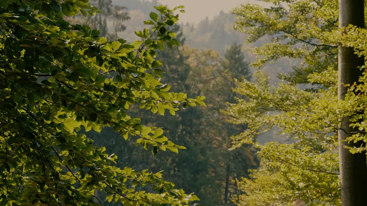
A meadow looks different in the morning and evening. Woodland may take on a green cast beneath the canopy, while water reflects the sky, plants and ground below. Natural colour is not always neutral.
A good colour correction keeps this quality of light. It should make the place feel believable rather than draw attention to unusually strong colours.
Begin with white balance
White balance controls whether an image appears warmer, cooler, greener or more magenta. Automatic white balance can change visibly between shots. A fixed setting often creates more consistency while the light remains similar.
Warm evening light may stay warm, and mist may remain cool. A grey reference can help in difficult conditions, but it is only a starting point.
Correct brightness before colour
Dark or overexposed areas also change the way colour appears. Check exposure, shadows and highlights first. Then decide whether individual colours really need correction.
Green can quickly look artificial when overall saturation is raised too far. Small changes to a limited range of greens or yellows usually feel more natural.
Compare neighbouring clips as well. Forest, sky and meadow may look different, but they should not feel as if they belong to unrelated colour worlds.
Try it directly
- Choose one suitable clip as a colour reference.
- Compare every correction with the original.
- Reduce the grade if colour is noticed before the subject.
In short
Natural colour does not have to be neutral. It should belong to the actual light and feel consistent across the film.